MedPaws

Overview:
As part of Google's UX Course, I created an app from an initial concept to a completed product design. As a pet owner and dog lover, I chose a project that I wanted to see in the market: an app that helps manage your pets and their prescriptions. I grew most from implementing UX and UI best practices throughout the design.
Project Time:
3 months
Roles:
Project Lead, Sole UX/UI Designer, UX Researcher
Responsibilities:
Wireframing, Usability Testing, Branding, UX/UI Design, Low & High Fidelity Prototypes
The Design Process

Empathize, Design, & Ideate
The Problem:
Pet medication has many risk factors and benefits, but your pet cannot tell you how they feel as they start a new routine. It can also be challenging to keep track of when you last gave prescribed medication to your pet, especially if the pet is a shared responsibility (e.g., being taken care of by a sitter).
The Goal:
This app aims to give pet owners an easy-to-manage prescription reminder so that they will be able to keep track of their pets as veterinarians prescribe new medications or diets.

JUNO
The Inspiration for this App:
My passion for creating this app came about when one of my dogs, Juno, was diagnosed with heartworm and would have to be on daily medication for 3 months. I wanted an app that would help my partner and me keep track of her medication schedule, be able to monitor her bathroom behavior for any signs of distress, and share updates through the app itself. This life event helped me decide the primary functions of MedPaws, and shared feedback inspired new ideas for what the app could accomplish.
User Personas:
Who can benefit from this app, and what features should be highlighted?


Storyboard and User Flow:
Based on the personas, it was clear that the primary function would be highlighting the schedule of one's pet - having alerts for when medications are needed, a way to record that the medication has been taken, and a schedule of the pet's behavior. I designed the user flow with these needs in mind.


Prototyping
Digital Wireframes


Testing
Empathy Map
I tested several participants in an unmoderated user study with my low-fidelity prototype, with questions about the app's navigation system and core functions. In doing so, several pain points stood out, which provided insights into my design.

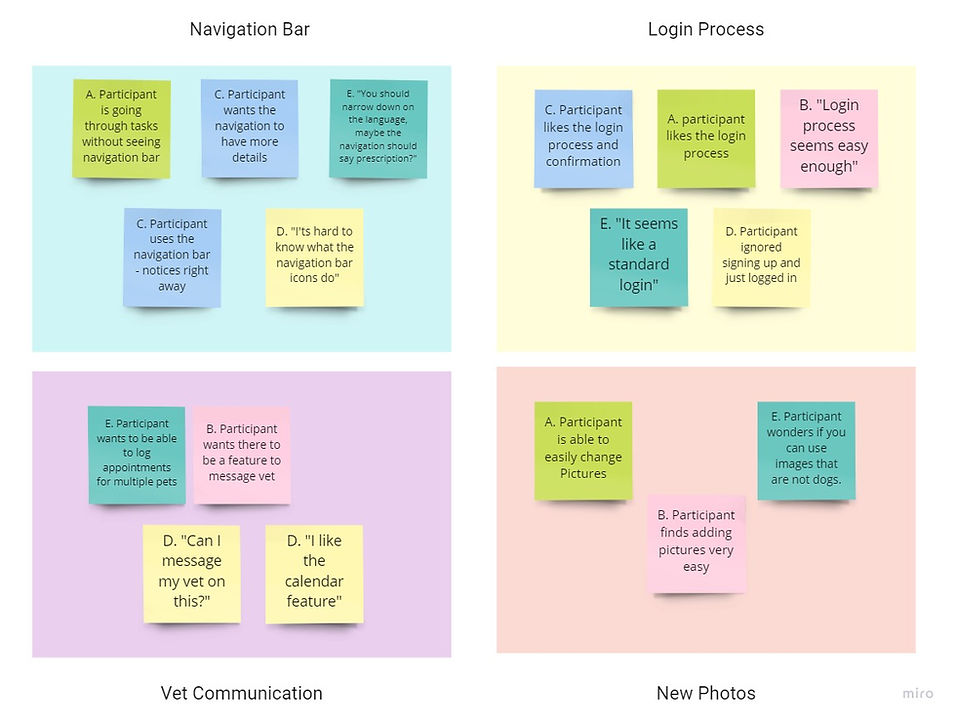
Pain Points:
-
Navigation bar hidden or unclear
-
Inconsistent terminology
-
Pages looked too similar
Insight #1
Problem: Participants, in general, disliked the navigation bar as it was, although some comments resulted from low contrast. A more significant concern was that the navigation bar led to more confusion instead of helping users get to the needed function. In particular, Participant A did not see there was a navigation bar at all, leading to confusion and frustration.
Solution: I created a navigation bar that stood out with more consistent icons and terminology that would let users know what each page was meant to do. I also needed to create a secondary pathway that led a user from choosing their pet to seeing the medications that the pet was on, which is essentially the core functionality of this app.
Before

MORE CTAs
NEW ICONS/INCREASED CONTRAST
After

Insight #2
Problem: Many of the pages had users select a pet before being able to move forward. This resulted in information being hidden behind menus and caused more navigation confusion.
Solution: I provided more information upfront on the Activity Log and Prescription pages, which gave the user a better indication of how to navigate the app. This created a more dynamic interface and quicker process for a user to get from point A to point B.
Before

INFORMATION ALREADY DISPLAYED
After

Moodboard
Regarding the pain points and personas, the color scheme of the app would be critical. I needed the information to be clear and clean, as any misreading of the information displayed could potentially harm one's pet.
I chose teal and white as the primary colors, as teal is a very soothing color, symbolizing one of the main themes of this app, care. White is also a healing color, and the combination creates a strong contrast that works well for the overall design.

High Fidelity Screenshots


